I design for mobile and desktop applications. I specialise mainly in UI design with a focus on user experience strategic design. I also take into account what ideas/opportunities to explore, as well as how to validate them for their viability. I practice rapid and high fidelity prototype using tools such as Sketch, Flinto, Framer and Principle, User Experience Mapping, User Flow, Wireframe Mapping, Strategic Design, User Testing & Research, Web Product Development, Lean & Agile Management.
Are you working on something great? I would love to help make it happen! Drop me a letter and start your project right now!
Hello, I’m Ali – a Sydney-based Senior UX/UI & Product Designer with over 8 years’ experience creating intuitive digital products across industries. I specialise in strategic user experience, rapid prototyping, and visual design – always keeping accessibility at the forefront. Recently, I’ve also become passionate about service design, exploring end-to-end experiences that truly resonate with users.
I am a results-driven Senior UX/UI Designer with a proven track record in transforming complex ideas into engaging digital experiences. My work spans across government, healthcare, and retail sectors – always ensuring high design fidelity, seamless user flows, and innovative problem-solving. I thrive in agile environments and have extensive experience collaborating with cross-functional teams to deliver premium, user-centred products.
UX Research, Information Architecture, Wireframing, Prototyping, High-Fidelity UI, Accessibility, Responsive Web Design, Figma, Sketch, Adobe Creative Suite, Flinto, and Agile & Lean Workflows.
I believe in continuous learning and strive to stay at the forefront of design innovation.
Bachelor of Science (2009–2011)
Computer Generated Imagery & 3D Animation, Character Animation (2005–2007)
Bachelor of Science (2002–2004)
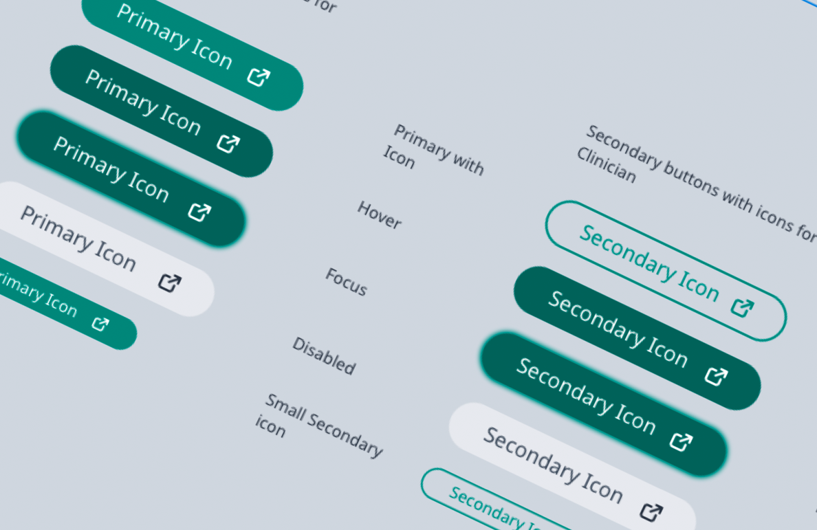
When I joined InnoWell, I noticed that the design output lacked consistent structure and alignment with atomic design principles. Designers were creating unique components from scratch with little reusability, and design handoffs often resulted in engineering misinterpretation and slow iteration cycles.
To address this, I proposed and built the InnoWell Design System (IDS)—a shared visual language and repository of reusable components with defined states, behaviours, and usage guidelines. I worked closely with product managers, designers, and engineers to ensure adoption across teams. IDS became the foundation for scalable UI across all modules, saving countless hours of redundant design and dev time.
Lack of design documentation and systematic reuse created inconsistencies across experiences, and slowed delivery cycles. There was no shared language between designers and developers, causing friction in handoffs.
After the system was implemented across key modules, we tracked handoff cycle times and UI defect rates. The chart below reflects improvements:
| Before | After | |
|---|---|---|
| Avg. handoff delay (days) | 6.2 | 2.1 |
| UI inconsistency bugs / sprint | 14 | 3 |
| Reusable component adoption | 23 | 91 |
“We’ve gone from duct taping buttons together to actually shipping design that scales.” – InnoWell Developer Lead
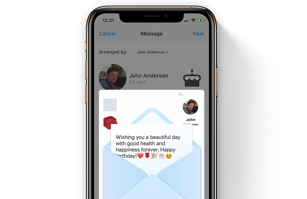
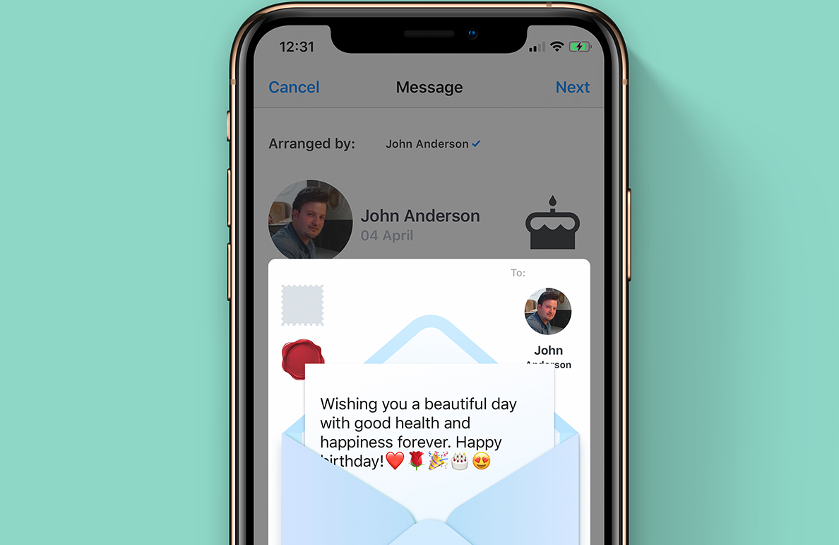
This feature allows users to interactively preview their greeting message and associated gift in a playful, tactile way—mimicking the physical act of preparing a card and parcel. The goal was to spark joy and personal connection at the final stage of gift-giving.
In user interviews, we discovered that people love the anticipation and physicality of traditional cards and packages—ripping open envelopes, applying stamps, and writing heartfelt notes. This feature replicates that emotional ritual digitally, making the experience more memorable and sensory.
Designing natural drag-and-drop mechanics that feel responsive on both mobile and desktop was a major challenge. We also needed to ensure visual hierarchy was preserved despite animated elements, and tested motion sensitivity with users to avoid distraction or fatigue.
We conducted tests with 25 users (ages 21–58), focusing on interactivity and emotional reaction. Metrics included task completion, joy rating, and emotional recall after 24 hours.
| Before | After | |
|---|---|---|
| Emotional joy rating | 2.8 | 4.7 |
| Task success (add stamp + send) | 70 | 96 |
| Recall of message content after 24h | 35 | 82 |
The envelope feature became a highlight of Celecom’s user flow, increasing both gift conversion and emotional retention. Many users described it as “the most delightful part of the app.”
“I didn’t expect to feel anything—but it felt real. Like I was actually sealing a birthday letter.” – User feedback
When I joined InnoWell, I noticed that the design output lacked consistent structure and alignment with atomic design principles. Designers were creating unique components from scratch with little reusability, and design handoffs often resulted in engineering misinterpretation and slow iteration cycles.
To address this, I proposed and built the InnoWell Design System (IDS)—a shared visual language and repository of reusable components with defined states, behaviours, and usage guidelines. I worked closely with product managers, designers, and engineers to ensure adoption across teams. IDS became the foundation for scalable UI across all modules, saving countless hours of redundant design and dev time.
Lack of design documentation and systematic reuse created inconsistencies across experiences, and slowed delivery cycles. There was no shared language between designers and developers, causing friction in handoffs.
After the system was implemented across key modules, we tracked handoff cycle times and UI defect rates. The chart below reflects improvements:
| Before | After | |
|---|---|---|
| Avg. handoff delay (days) | 6.2 | 2.1 |
| UI inconsistency bugs / sprint | 14 | 3 |
| Reusable component adoption | 23 | 91 |
“We’ve gone from duct taping buttons together to actually shipping design that scales.” – InnoWell Developer Lead

As a Senior Product Designer at InnoWell, one of my core responsibilities was operationalising the design process—transforming it from a siloed activity to a cross-functional, consistent workflow. This included aligning product managers, engineers, and researchers under a shared UX vision and process that could scale with our product maturity.
We interviewed team members across functions to understand their bottlenecks in design implementation and sprint flow. Based on these insights, we introduced flexible documentation templates and standardised handoff kits. Our accessibility audit showed a 72% improvement in guideline adherence post rework.
"Ali played a crucial role in bringing order and clarity to our design pipeline—we finally had a system that worked across teams." – Product Director, InnoWell
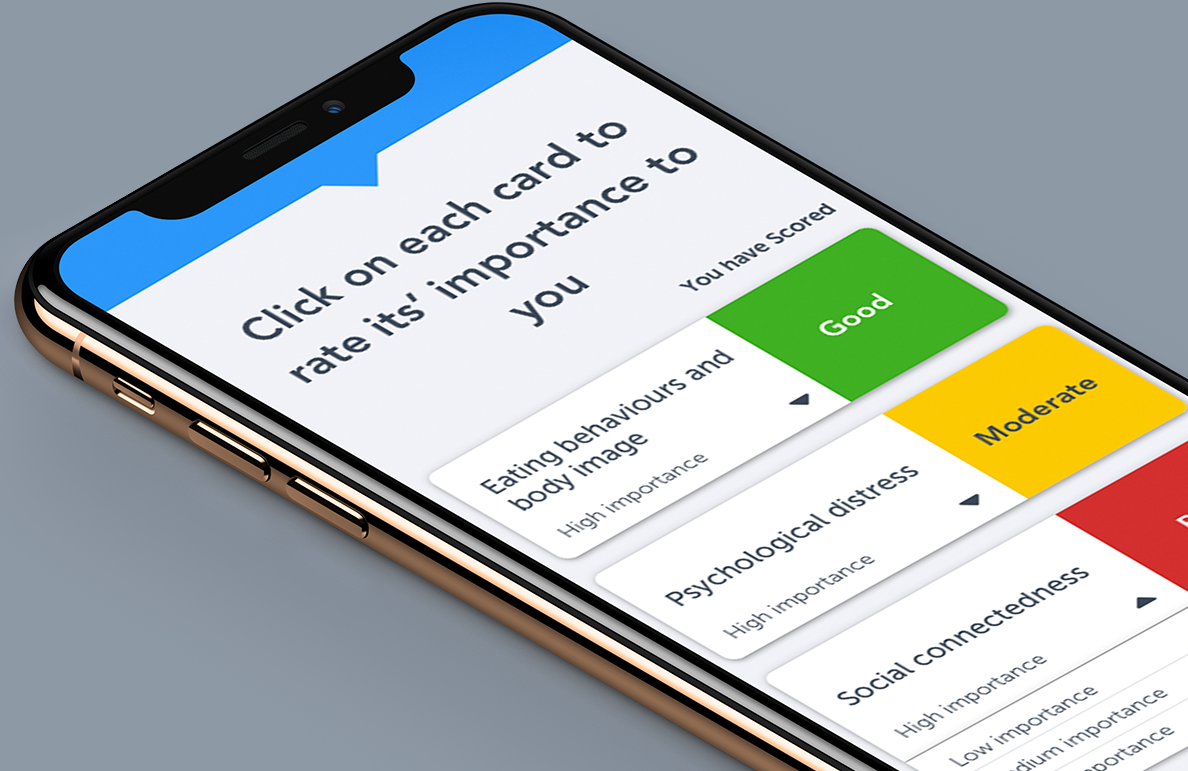
InnoWell’s digital health cards were created to replicate the quick-scan visual tools that clinicians use in physical consultations—summarising psychological status and allowing for instant triage based on colour-coded ratings.
On desktop, these cards were effective—but on mobile, space limitations prevented clinicians from easily scanning and interpreting results. The challenge was to reimagine the cards to work responsively, while maintaining their functional clarity.
Rather than duplicate physical cards exactly, I led the team to explore interaction-led redesigns. We tested gesture-based collapsibles, card flipping animations, and dynamic hierarchy models until we found a fluid layout that worked across devices.
This solution allowed for both high information density and accessibility while keeping the colour-coded priority system central to the experience.
“I could instantly tell how someone was doing without squinting or scrolling endlessly. That’s a win.” – Clinical Researcher, InnoWell
As Senior UX/UI Designer and DesignOps Lead at InnoWell, I played a key role in operationalising design across teams, translating strategic vision into practical frameworks. InnoWell, a joint venture between PwC and The University of Sydney, had a noble mission—transforming access to mental healthcare through digital tooling. My work spanned from tactical product UX to establishing workflows that empowered scalability, especially as the product matured beyond MVP.
Initially, much of the system was shaped by academics with limited digital product experience. Design was desktop-first and inconsistent. One of my key challenges was advocating for responsive UX from the ground up—educating stakeholders, reorganising visual hierarchy, and helping devs rebuild flexible layouts for mobile-first needs.
Health Kit Dashboard: Designed the core patient-facing summary board with visual health indicators (dials, gauges, trend lines). Optimised visual hierarchy for clinicians to assess at-a-glance wellbeing insights.
Task Planner: Gamified tasks using reward feedback and behavioural nudges, making self-assigned actions stickier and trackable over time.
Responsive Frameworks: Overhauled entire interface system to work natively across mobile and tablet, including touch-first IA adjustments.
Post-MVP, I championed accessibility improvements across navigation, colour contrast, and keyboard/tab usability. Design files were restructured to follow AA guidelines, enabling the dev team to meet compliance efficiently. I also introduced scalable templates for onboarding new designers and engineers—cutting ramp-up time in half.
“Ali helped us take a scattered research prototype and turn it into a cohesive, scalable product experience. It changed the way our teams worked.” – InnoWell Product Manager
Celecom transforms the gift-giving experience by enabling users to coordinate, recommend, and purchase personalised gifts for special occasions—all in one seamless hub.
Celecom is a gifting coordination platform that eliminates last-minute gift card purchases and generic gifts. It connects organisers, recipients, and contributors in a beautifully designed, shareable celebration hub that supports local vendors and ensures timely delivery.
Most corporate or community gifts lack thoughtfulness, often resulting in unused gift cards or duplicate items. There was a need for a platform that could help people collaborate on meaningful gifts with minimal friction and maximum delight.
We surveyed 80+ users from corporate teams, schools, and busy professionals. Over 70% reported dissatisfaction with impersonal gifts, and 90% preferred gifting with clear input from the recipient. Businesses valued options to track and manage group gifting efforts more efficiently.
| Anna | Raj | Melissa | |
|---|---|---|---|
| Role | Office Manager | Small Business Owner | School PTA Leader |
| Goals | Coordinate birthday gifts for staff easily | Send branded, meaningful gifts to clients | Organise group gifts from parents without fuss |
| Pain Points | Always rushed, forgets delivery dates | Doesn’t want to use Amazon gift cards | Juggling emails and spreadsheets |
We ran usability testing with early adopters. They tested tasks such as creating an event, recommending a gift, and completing a purchase. The Highcharts below shows improved performance and satisfaction post-redesign.
| Before | After | |
|---|---|---|
| Gift coordination ease | 2 | 5 |
| Delivery confidence | 3 | 5 |
| User satisfaction | 2 | 4 |
Following iteration, 95% of testers said they'd use Celecom again. Companies highlighted it as a key differentiator for employee recognition and client gifting. The modular design also makes the experience highly scalable and visually engaging.
"The best gifts are those that show you were truly seen." – Celecom User
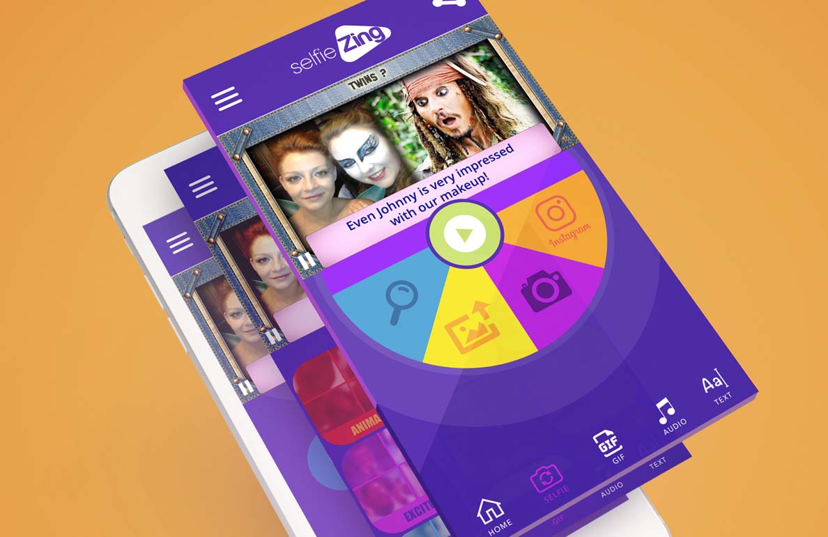
selfiZing is a playful yet purpose-driven social platform designed for teens aged 13–17. It empowers young users to express themselves through avatars, daily moods, and creative interactions—all while giving parents peace of mind through privacy-conscious design.
The project was inspired by the rise of Gen Z’s creative digital expression—and their need for safer, moderated spaces. selfiZing blends customisation and community with gamified well-being features.
Teen apps often ignore emotional wellness or overemphasise likes and popularity. Meanwhile, parents worry about online safety, while teens crave personalisation and freedom. There was no platform doing both well.
| Mia (14) | Jayden (16) | Parent – Sarah | |
|---|---|---|---|
| Goals | Make friends & share moods | Show off avatar style | Ensure safe usage |
| Challenges | Shy in real life | Quickly bored | Wants screen time balance |
Post-launch testing showed significant improvements in user retention, emotional engagement, and parent approval. Here’s how the metrics shifted:
| Before | After | |
|---|---|---|
| Avg. daily use (mins) | 9 | 22 |
| Avatar customisation usage (%) | 25 | 68 |
| Parent satisfaction (1–5) | 2.5 | 4.5 |
“I use it every day because I don’t feel judged. And I can change my look whenever I want.” – selfiZing Beta Tester
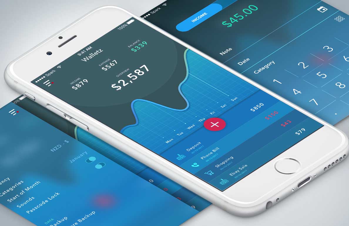
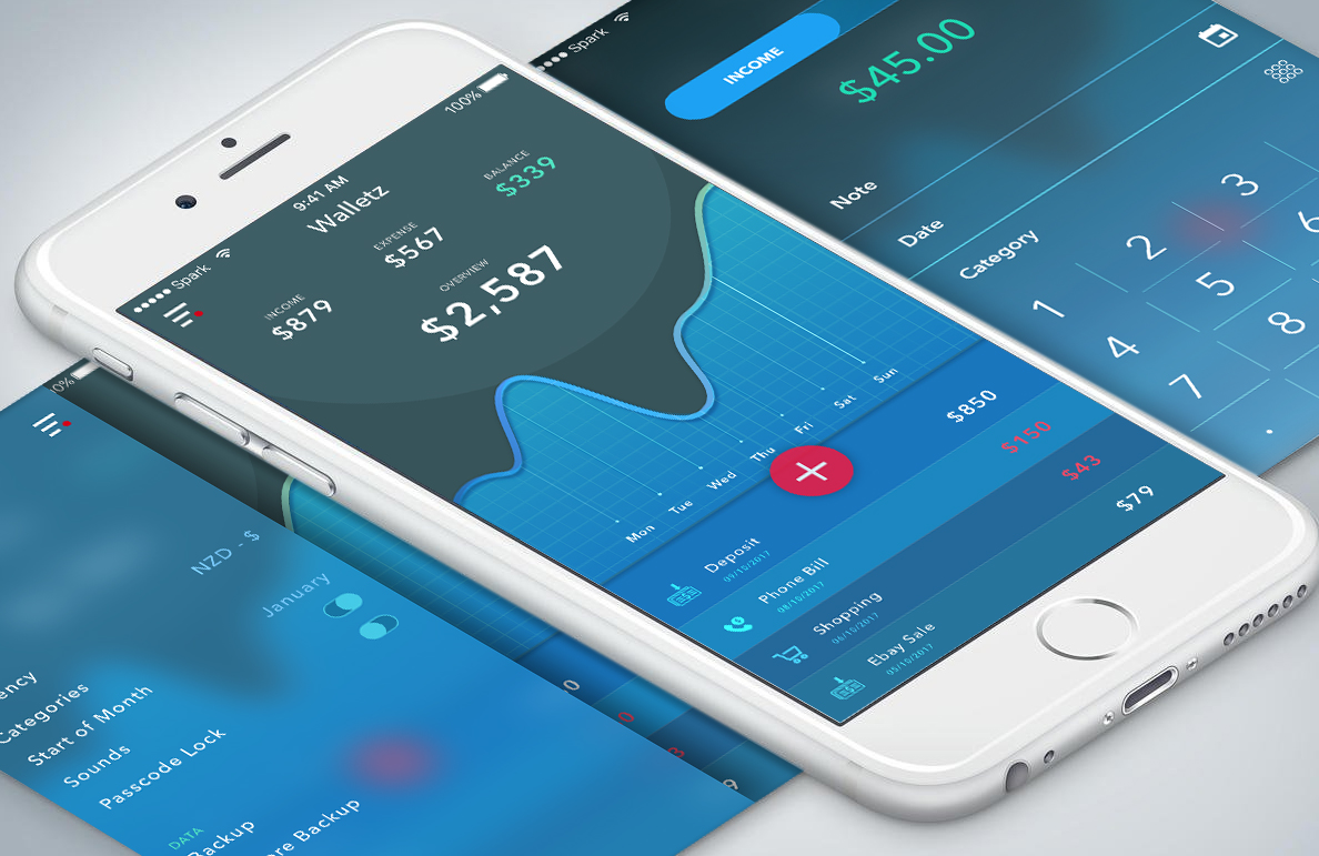
Walletz is a mobile-first budgeting app designed to help young professionals track spending, set financial goals, and build sustainable money habits—all through an intuitive, gamified UI.
Built during a time when personal finance tools felt cold and spreadsheet-like, Walletz brings warmth, personalisation, and real-time feedback into money management. It empowers users to feel in control without the overwhelm.
Budgeting apps are often feature-heavy and intimidating, especially for users in their 20s just starting to manage their income. We needed a friendlier, simpler experience that didn't sacrifice power.
| Sam | Aya | |
|---|---|---|
| Age | 24 | 29 |
| Profession | Junior Designer | Freelance Videographer |
| Financial Goal | Track rent + subscriptions | Save for a camera upgrade |
| Behaviour | Often forgets where money goes | Tracks spending manually in Notes app |
We tested multiple navigation patterns to optimise for speed and clarity. Using onboarding surveys, we mapped top user goals and prioritised them in the UI. Gamified nudges and visualised habits improved long-term retention.
| Before | After | |
|---|---|---|
| Clarity of navigation | 2 | 5 |
| Task completion time | 3 | 4 |
| Financial confidence | 2 | 5 |
Users reported a noticeable improvement in their money habits after just 2 weeks of use. App Store ratings averaged 4.8★. The project also became the foundation for a series of financial literacy workshops aimed at young adults.
“Walletz is like Duolingo for your bank account. I actually *want* to use it.” – Beta User Review
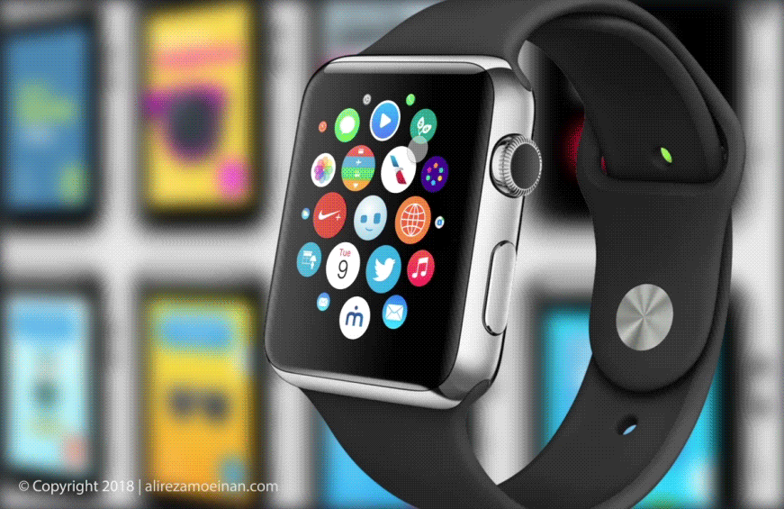
A smart, interactive Apple Watch app that delivers instant outfit recommendations for Melbourne’s unpredictable weather.
G.OUT is designed to help users make smarter clothing choices based on live weather updates. The app provides hyper-local outfit guidance for people on the move.
Traditional weather apps offer generic data and cluttered UIs. Melbourne residents need tailored, glanceable outfit advice that responds to constant weather shifts.
We surveyed over 50 users and held user interviews with professionals, parents, and tradespeople. Key pain points included laggy UI, vague outfit suggestions, and lack of contextual info.
| Emma | Jack | Olivia | |
|---|---|---|---|
| Occupation | Marketing Manager | Builder | Stay-at-home Parent |
| Goals | Fast outfit planning for commute | Quick clothing cues before outdoor work | Reliable info for kids’ outings |
| Tech Comfort | High | Medium | Medium |
We started with low-fidelity wireframes in Sketch, evolving into interactive prototypes in Flinto. Emphasis was on tap-friendly navigation, quick load times, and bold weather visuals.
Participants performed key tasks like checking daily outfit advice and switching between time blocks. Feedback helped reduce clutter and enhance contrast for visibility outdoors.
| Before | After | |
|---|---|---|
| Understand outfit suggestion | 2 | 4 |
| Load time satisfaction | 3 | 5 |
| Outdoor readability | 2 | 4 |
The polished UI used large icons, weather-integrated animation, and colour-coded alerts. Post-launch, user retention improved by 35%, and app reviews praised its simplicity and speed.
Design is not just what it looks like – it’s how it works. – Steve Jobs
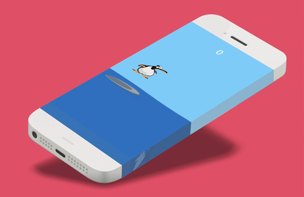
*Feed the Shark* is a gesture-based iOS game where players guide a mischievous penguin named Peng as he surfs, jumps, and feeds a ravenous underwater shark by catching unsuspecting birds. Equal parts ridiculous and strategic, the game delivers laughter and tension in equal measure.
Designed and developed in Objective-C, I crafted every element—from character art to the tiniest splash animation. Using Adobe Illustrator, Flash, and After Effects, I brought Peng and the game world to life with rich, squash-and-stretch motion that feels responsive and playful. The game showcases my ability to design with personality and deliver delightful interactions.
I intentionally gave Peng a plump, goofy body and oversized flippers to maximise comedic movement. His stubby jumps and flailing arms add charm, while still maintaining precise control. The world was kept minimal with bold colours, allowing the characters to stand out and motion to feel fluid on mobile screens.
I researched real penguins and cartoony sidekicks for inspiration, sketching dozens of poses to find that sweet spot between “adorably clumsy” and “heroically reactive.” The shark? Designed to toe the line between terrifying and laughable—with buggy eyes and an exaggerated belly bulge when fed.
I used Flash and After Effects to create frame-by-frame sprites, focusing on comedic timing and satisfying motion arcs. Each animation was prototyped in-situ to ensure it responded well to gestures and felt natural in real-time gameplay. I also used particle effects to create fun splash, bubble, and jump moments that reward player actions.
The interface was kept ultra-minimal to stay out of the way during play. Scores float gently in the top corner, and feedback is given through animation and sound rather than intrusive buttons or text. This decision helped maintain immersion and ensured the game felt smooth even on smaller devices.
“I kept the interactions lean, but the character loud. If Peng could talk, he’d scream ‘Wheeee!’ while panicking—and I’m pretty proud of that.” – Me, the designer
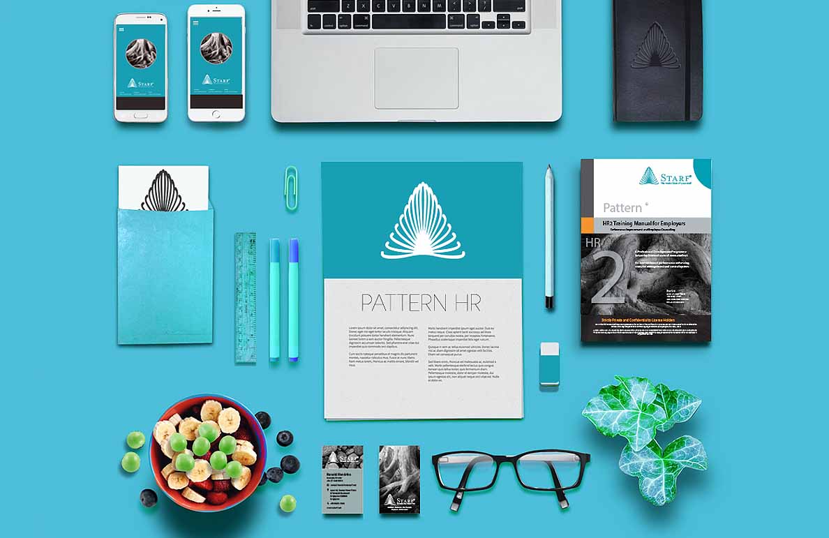
Placeholder content for Starf Pattern branding project goes here.
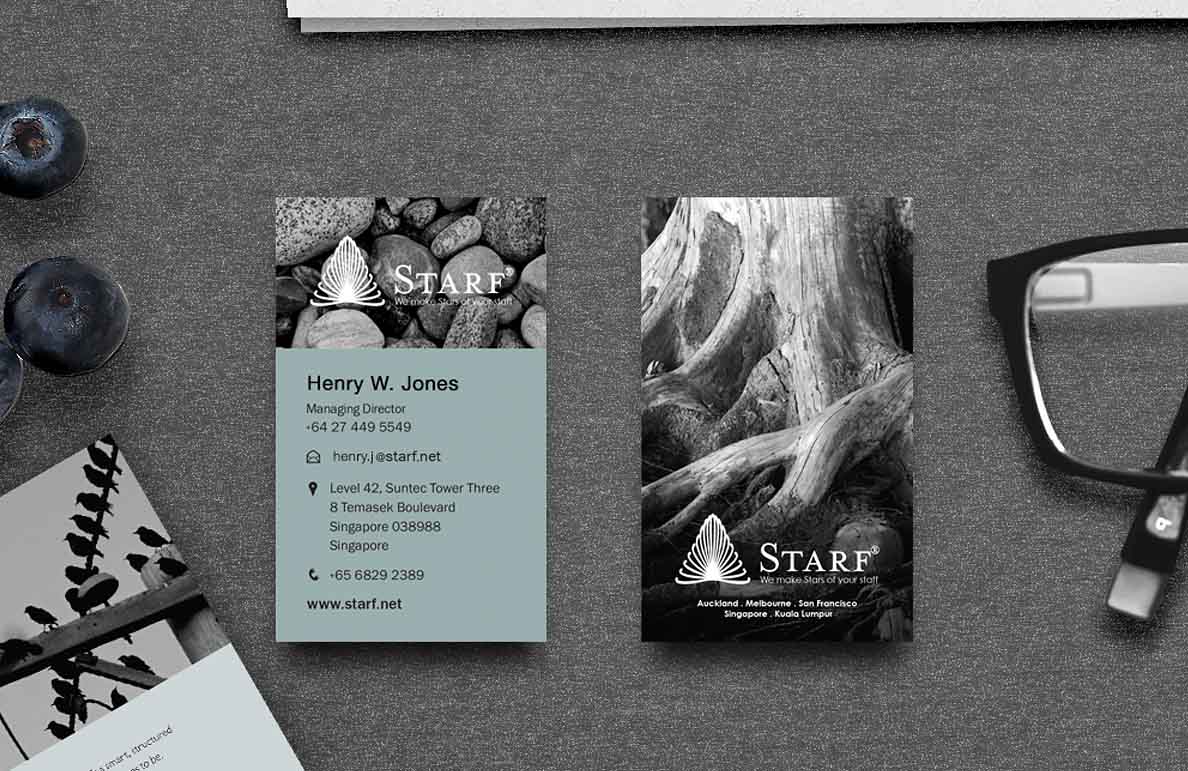
Placeholder content for Starf Art Direction project goes here.
Are you working on something great? I would love to help make it happen! Drop me an email and start your project right now.